Theme Editor
The theme editor controls your shop's overall look and feel: colors, fonts, spacing, corner radii, and button styles. Changes made here affect the entire shop — unlike individual CMS pages, which only affect their own content.
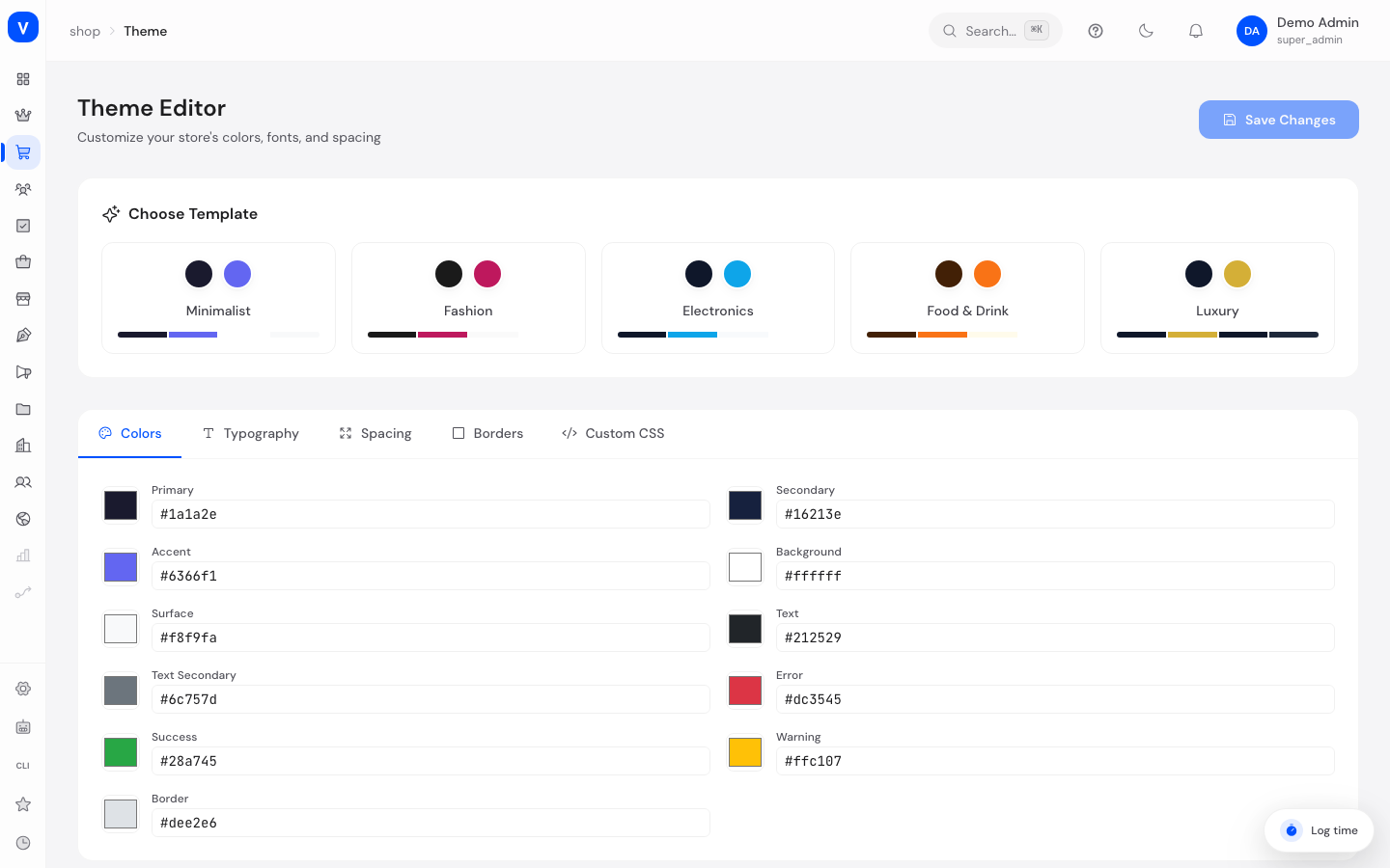
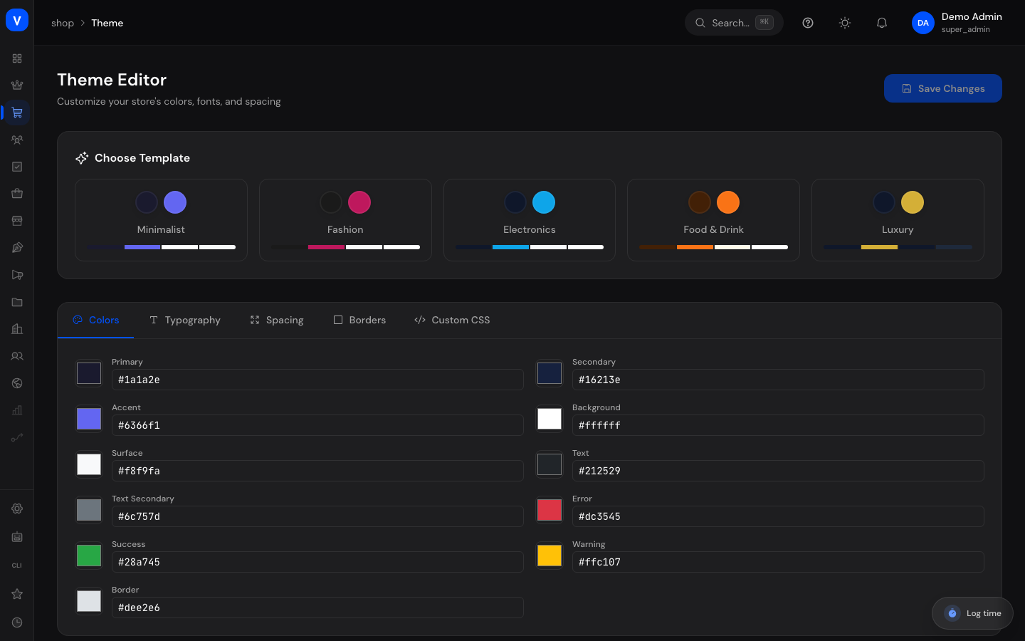
/shop/themeWhat can I do here?
- Choose and activate a ready-made design preset
- Set colors for primary, secondary, and other elements
- Adjust font, font size, line height, and heading weight
- Adjust spacing (container width, section, card, and grid gap)
- Set corner radii and border widths
- Add custom CSS for deeper adjustments
- Check changes in a live preview before saving
Step by step
- Choose a preset: Click one of the five design presets (Minimalist, Fashion, Electronics, Food & Drink, Luxury) in the preset gallery to activate it.
- Fine-tune settings: Switch between the "Colors", "Typography", "Spacing", "Borders", and "Custom CSS" tabs to adjust individual values.
- Check the preview: Watch the live preview panel on the right, which shows a heading, text, a sample card, and buttons using the currently selected settings.
- Save: Click "Save changes". Use "Reset" to discard unsaved changes and return to the last saved state.
Fields explained
| Field | Meaning | Notes/Effect |
|---|---|---|
| Colors (Primary, Secondary, Accent, Background, Surface, Text, Text Secondary, Error, Success, Warning, Border) | The shop's color palette | Affects buttons, backgrounds, status messages, etc. |
| Font family / Heading font | Google fonts used for body text and headings respectively | Chosen from a fixed list of common fonts; the list has a search box, simply type the name of the font you want |
| Font size | Base font size in pixels | Affects readability throughout the shop |
| Line height | Spacing between lines of text | Affects readability of longer texts |
| Heading weight | Font weight (boldness) of headings | From thin to very bold |
| Container width | Maximum width of the main content | Determines how wide page content stretches |
| Section/Card/Grid gap | Inner/outer spacing between elements | Affects how generous the layout feels |
| Border radius | Rounding of corners (e.g. on cards, buttons) | Smaller values look more angular, larger values rounder |
| Border width | Thickness of border lines | Affects card and input field borders |
| Custom CSS | Freely usable extra styling code | For experienced users only, overrides default values |
Values & status
Design presets
| Value | Plain-language meaning |
|---|---|
| Minimalist | Clean, modern preset with an indigo-blue accent |
| Fashion | Elegant preset with a dark base tone and a pink accent, serif-heavy headings |
| Electronics | Technical, cool preset with a dark blue base tone and a light blue accent |
| Food & Drink | Warm preset with brown tones and an orange accent, rounded corners |
| Luxury | Dark, upscale design with a gold accent and serif-heavy headings |
Frequently asked questions
How do I quickly change my shop's overall look?
Pick one of the five design presets in the preset gallery — colors, fonts, and spacing are applied automatically.
I made changes but don't see them in the shop yet. Why?
Click "Save changes". Unsaved changes are only visible in the preview.
How do I undo my changes?
As long as you haven't saved yet, click "Reset" to return to the last saved state.
What's the difference between the theme editor and "Customize template"?
The theme editor sets global design basics (colors, fonts, spacing) that apply across the whole shop. Customize template additionally lets you design the actual page structure (header/footer, sections per page type).
What's the "Custom CSS" field for?
For additional, targeted styling adjustments beyond the standard options. It's intended for users with CSS knowledge.
Where exactly do the theme values apply in the shop?
On every control in the shop, without exception. Buttons in the "primary" appearance carry your primary color, your corner radius, your font weight and your text transform; secondary buttons additionally carry your border color. Input fields - sign-in, account, checkout, newsletter, returns - carry your border color, your corner radius and your primary color as the focus ring. There is nothing to configure for this: saving the values in the theme editor is enough.
I have not set a color of my own. What does my customer see?
The default values of the selected design preset. No element is ever left without a color or without a border; a value you have not set always falls back to the preset value.
The controls look slightly different since the last update. Is that intended?
Yes, to a small degree. Buttons and input fields now follow one shared height scale (44 pixels for the large controls, 36 pixels for the small ones) instead of a height derived from their content. Color, corner radius, font weight and text transform are unchanged and still come from your theme.