Tooltips
Tooltips are individual hint speech bubbles at specific spots in your online shop. There are two kinds: Hints — help icons that are either always visible or appear on hover, showing an explanatory text — and Beacons — small, colored attention dots that point out something new and can optionally launch a guide.
What can I do here?
- Create, edit, and delete hints
- Create, edit, and delete beacons
- Search by name and filter by status
- Provide text in German and English
- Choose which audiences see a given hint or beacon
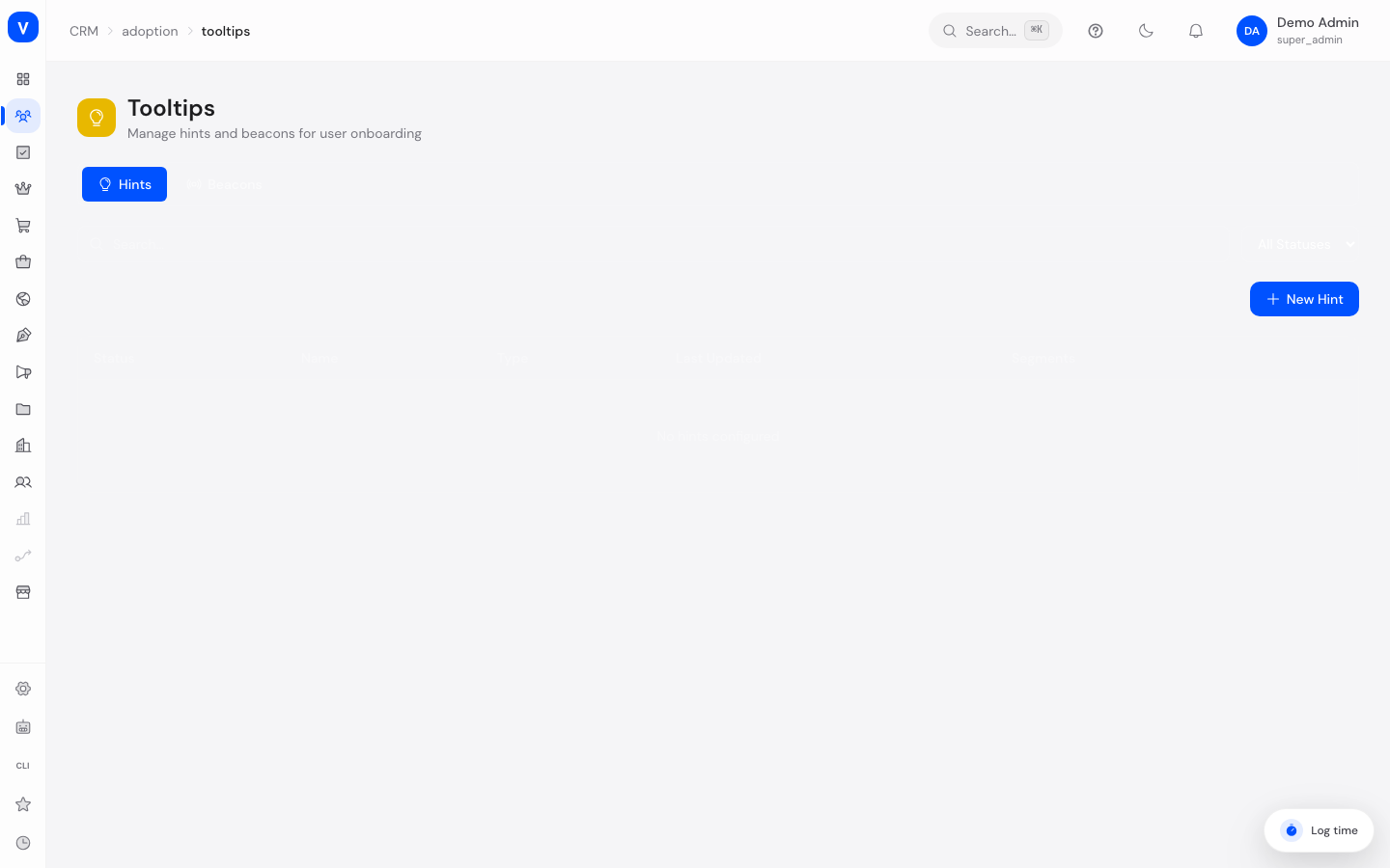
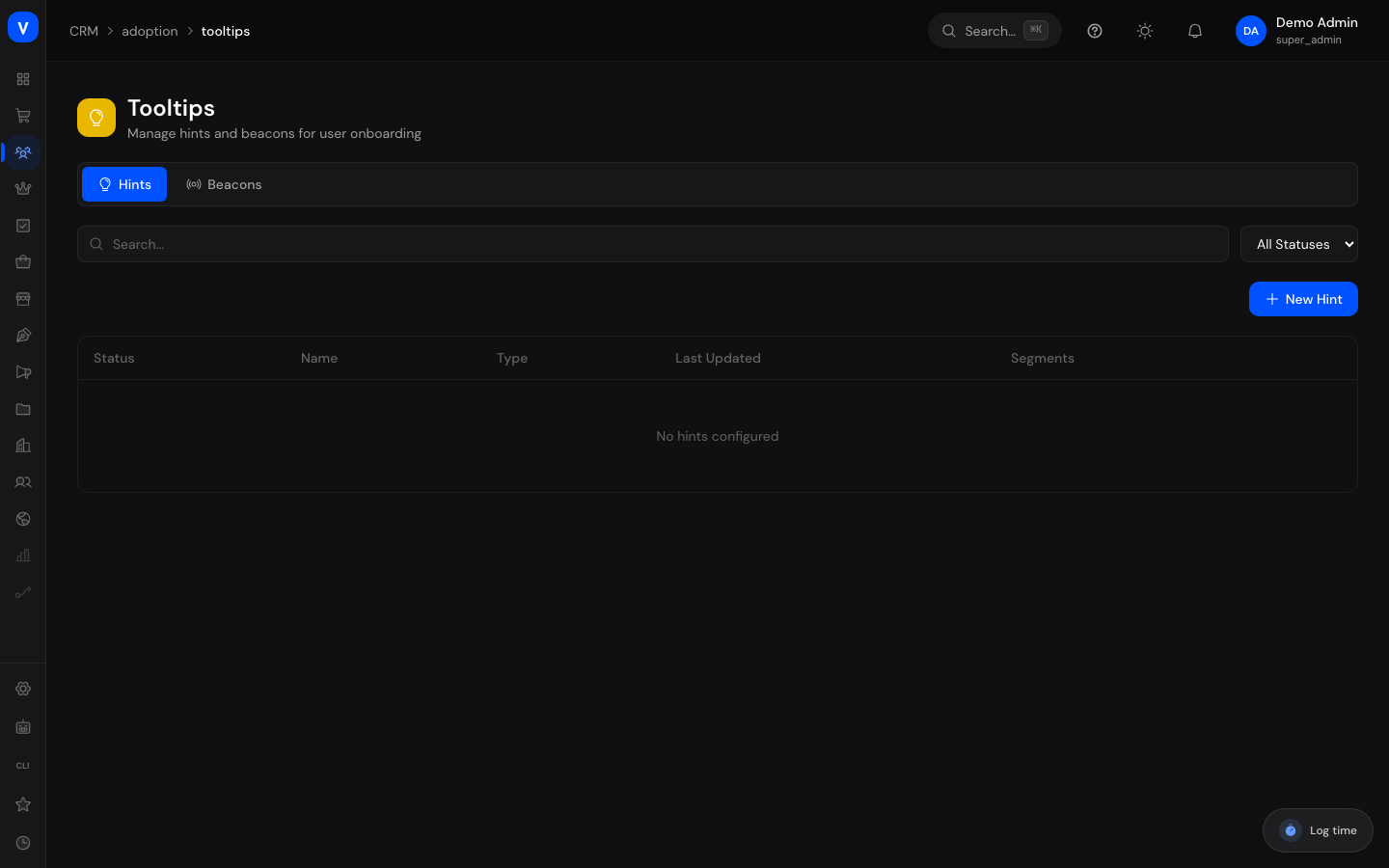
/crm/adoption/tooltipsStep by step
Create a hint
- Switch to the Hints tab and click New hint.
- Give it a name and enter the CSS selector of the element the hint should appear on.
- Fill in the content in German and/or English.
- Choose the speech bubble's position and the icon's position.
- Optionally set the hint to only show on hover.
- Set the status to "Active" and save.
Create a beacon
- Switch to the Beacons tab and click New beacon.
- Give it a name, the CSS selector of the target element, and the content in German and/or English.
- Choose a color for the attention dot.
- Optionally link a guide that launches when the beacon is clicked.
- Set the status to "Active" and save.
| Name | Type | Status | Segments | Last Updated |
|---|---|---|---|---|
| Dashboard help | Beacon | ✓Active | New accounts | 12 Aug 2026 |
| Discover reports | Beacon | •Draft | All | 05 Aug 2026 |
/crm/adoption/tooltipsFields explained
Hint
| Field | Meaning | Notes/Effect |
|---|---|---|
| Name | Internal name of the hint | Required |
| CSS selector | What identifies the target element in the shop | Required, e.g. #my-button, .nav-item |
| Content (German) / Content (English) | Text shown in the hint | At least one language should be filled in |
| Position | Which side of the target element the speech bubble appears on | E.g. top, bottom, left, right |
| Icon position | Which side of the target element the hint icon sits on | E.g. top, bottom, left, right, and diagonals |
| Hover only | Whether the hint only appears when hovered with the mouse | If off, the icon is always visible |
| Status | The hint's current state | See Values & status below |
Beacon
| Field | Meaning | Notes/Effect |
|---|---|---|
| Name | Internal name of the beacon | Required |
| CSS selector | What identifies the target element in the shop | Required |
| Content (German) / Content (English) | Text shown when clicked | At least one language should be filled in |
| Color | Color of the attention dot | Freely selectable via color picker or hex code |
| Linked guide | Guide that launches when clicked | Optional |
| Status | The beacon's current state | See Values & status below |
Values & status
| Value | Meaning | What happens |
|---|---|---|
| Draft | Still being worked on | Not visible in the shop |
| Active | Live | Visible in the shop to matching customers |
| Inactive | Deliberately turned off | Not visible in the shop, but kept |
Common questions
What's the difference between a hint and a beacon?
A hint is an explanatory help icon with text, a beacon is an eye-catching, colored dot that draws attention to something new and can optionally launch a guide.
Why don't I see my hint in the shop?
Check whether the status is "Active", whether the CSS selector correctly points to an existing element, and whether the setup snippet has been added to the shop.
Can I show a hint only to certain customers?
Yes, the "Segments" column shows how many audiences a hint or beacon is assigned to.
Do I have to fill in both languages?
No, one of the two languages is enough, though you should consider all the customers using your shop.